
VitalGlobin
Blood transfusion bags are vital to the doctors that use them but the current bags tend to be flimsy, hard-to-read and difficult to work with. VitalGlobin seeks to change all of that by putting their emphasis on user experience.
VitalGlobin is a thought experiment conducted to see if the current transfusion bags could be improved upon. While it does not exist, all aspects of it's creation adhere to the American Association of Blood Bank's guidelines. In the future, I would love to make this a reality if possible.
VitalGlobin is a thought experiment conducted to see if the current transfusion bags could be improved upon. While it does not exist, all aspects of it's creation adhere to the American Association of Blood Bank's guidelines. In the future, I would love to make this a reality if possible.

When a patient is in surgery in the emergency room, every second matters. Getting the wrong type of blood could be fatal. That's where VitalGlobin comes in. By putting the user first, the company hopes to save lives by focusing on the product's usability.
How can we make blood transfusion bags more usable?
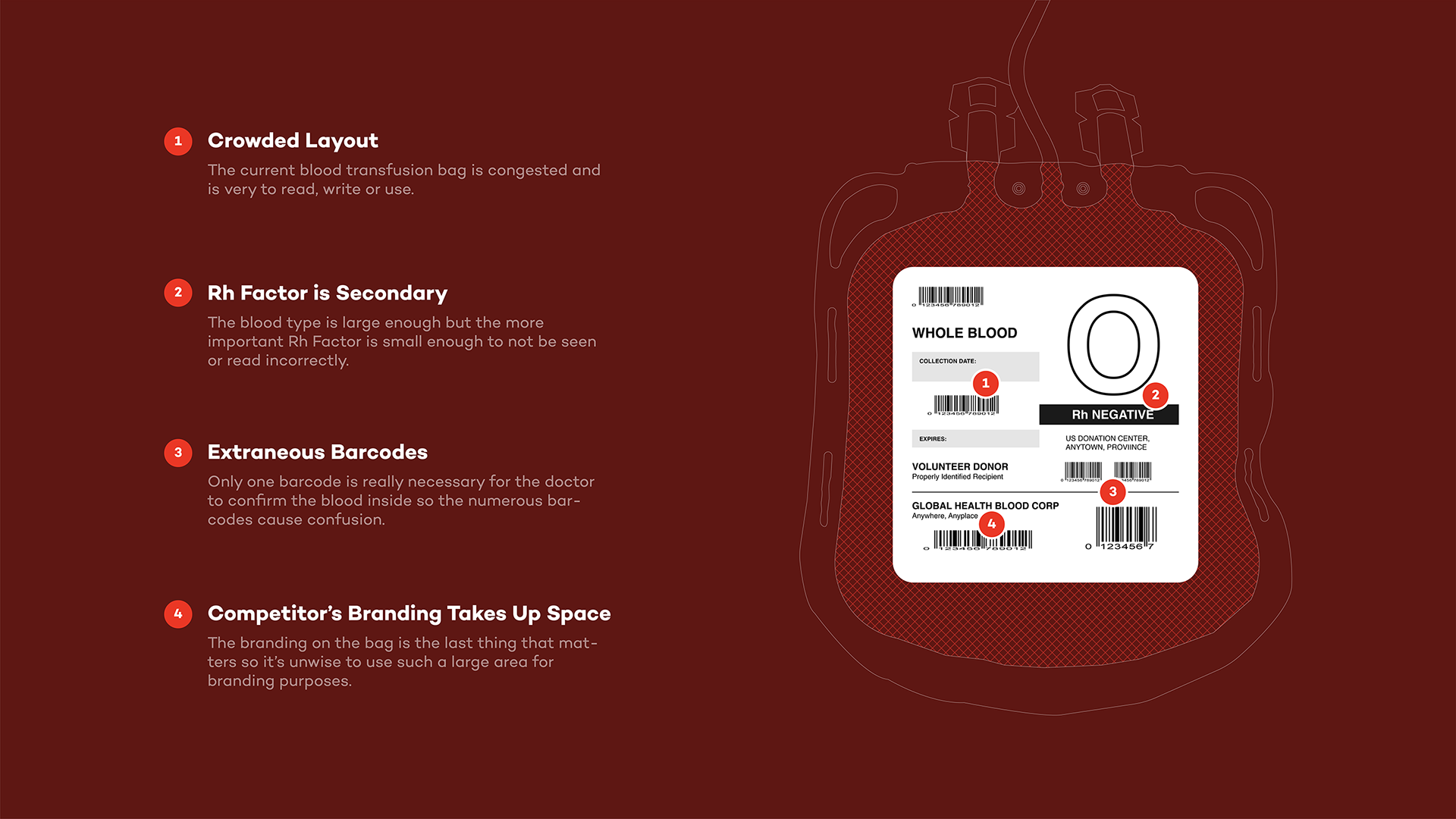
Since transfusion bags are the main touchpoint for this brand, it was essential that the current bags be analyzed to understand what needed to be improved. Since VitalGlobin was entering an existing market, combating the current industry leaders meant understanding their strengths and weaknesses first.
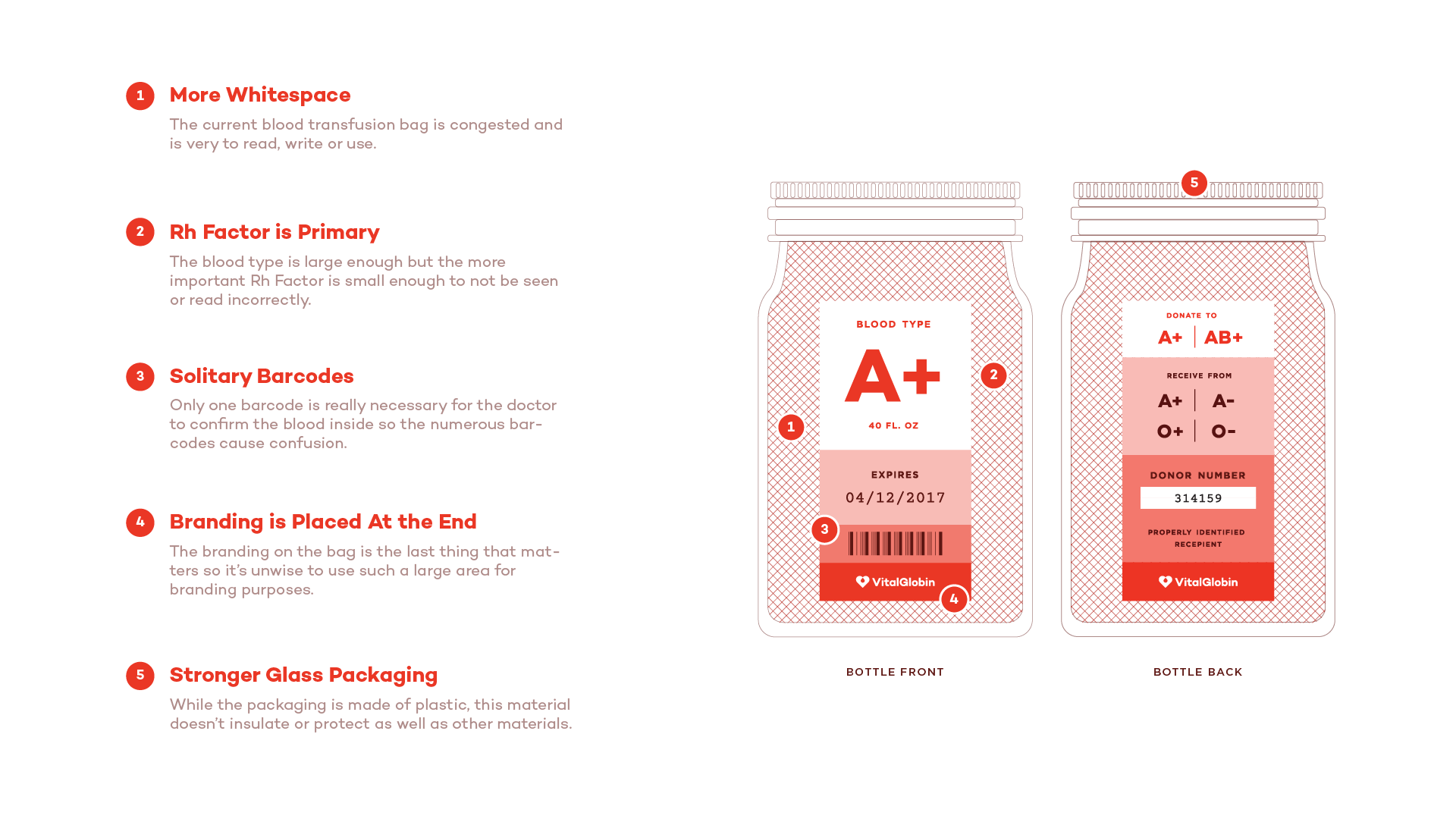
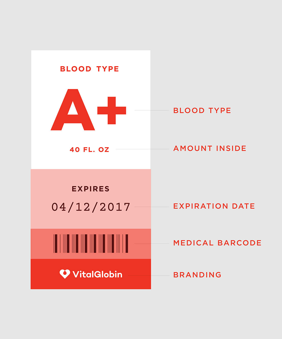
The bag diagram shown below is an amalgam of several industry standard bags.
The bag diagram shown below is an amalgam of several industry standard bags.
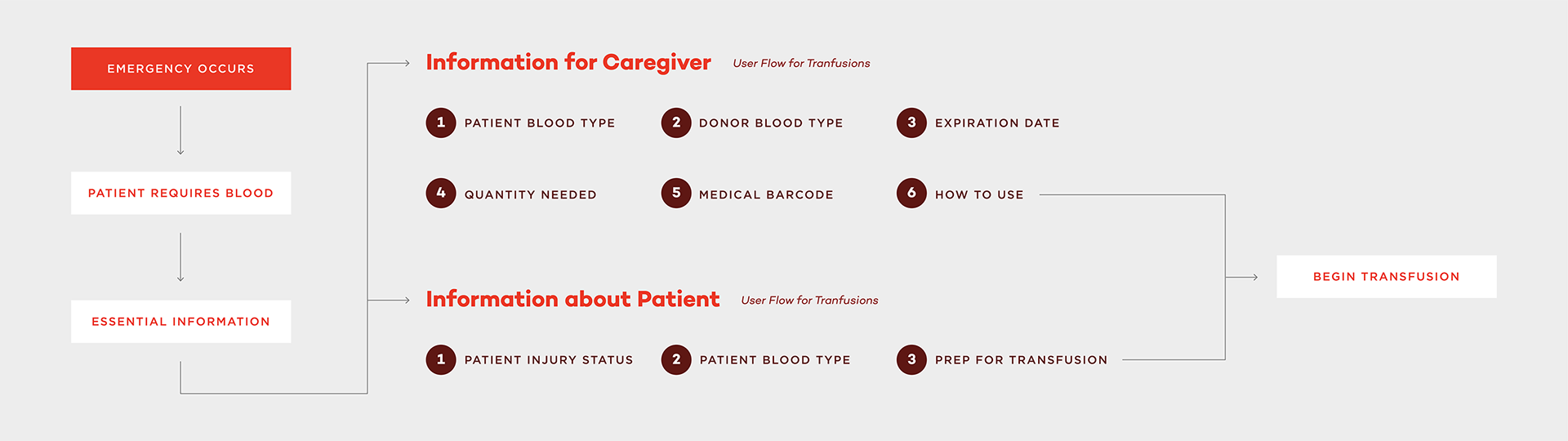
Understanding the order of events leading up the transfusion was crucial. Many of the necessary pieces of information that were needed for the product came forward in this initial discovery phase.
Moving forward, the information from the user experience were competitive analysis were used to start laying out the framework for the brand.
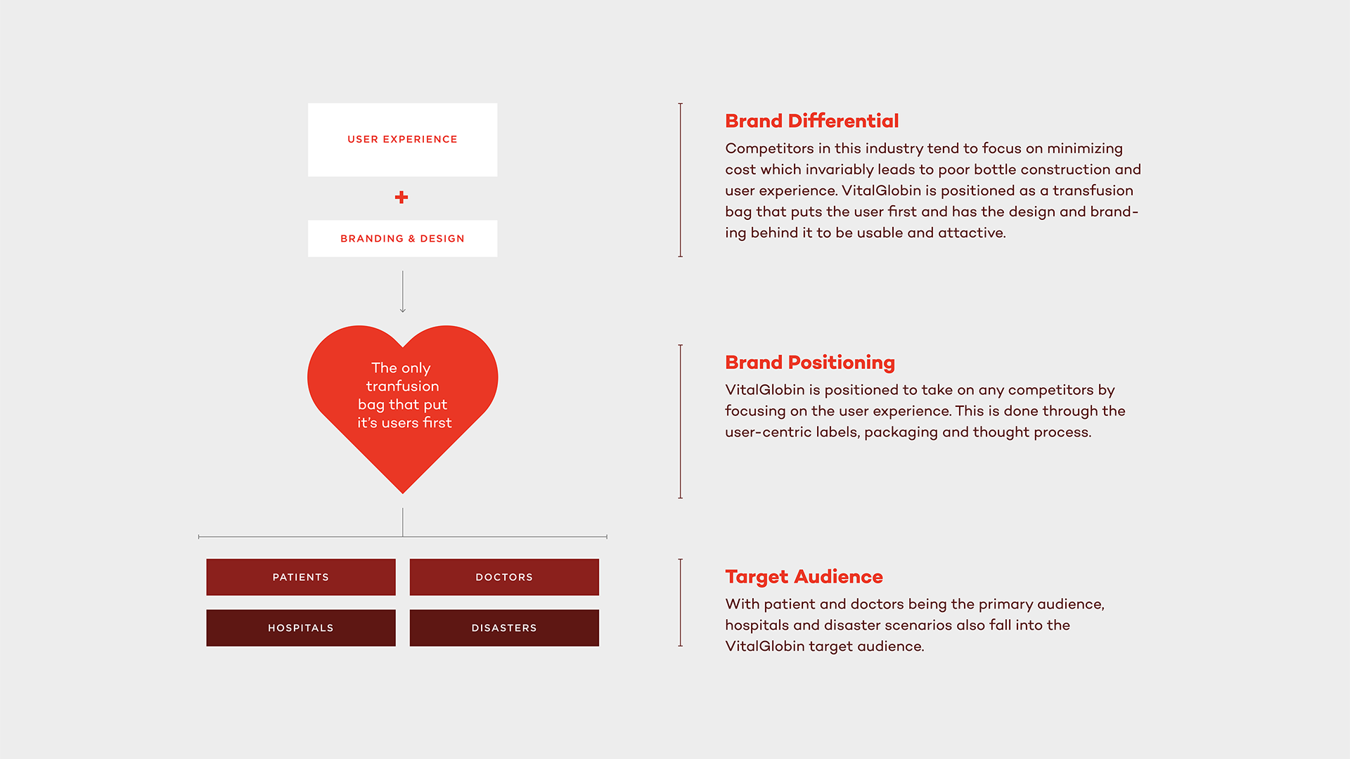
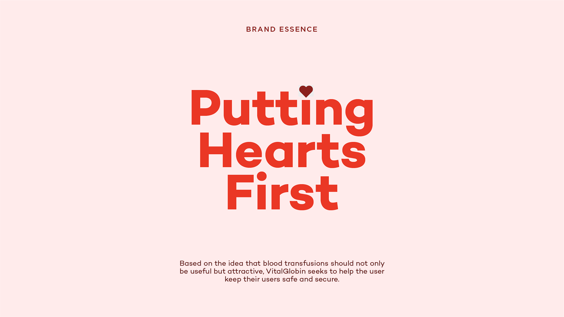
The brand idea serves as the "big picture" for the brand and acts as a filter. If the designs don't fit into the brand idea, the brand doesn't do them. This is an easy way to summarize the brand into a simple phrase.
After finalizing the brand's strategy, the next step was design. The brand's symbol was created using the two main elements of the product. Adhering the Paul Rand's SMART principles, the mark is meant to be simple and timeless.
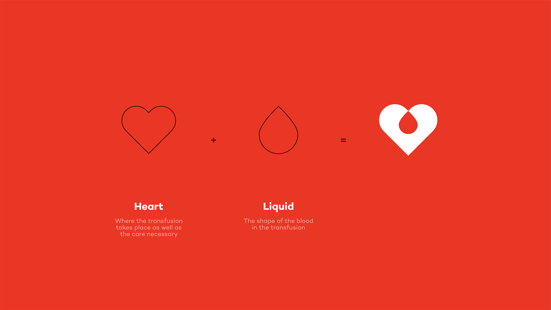

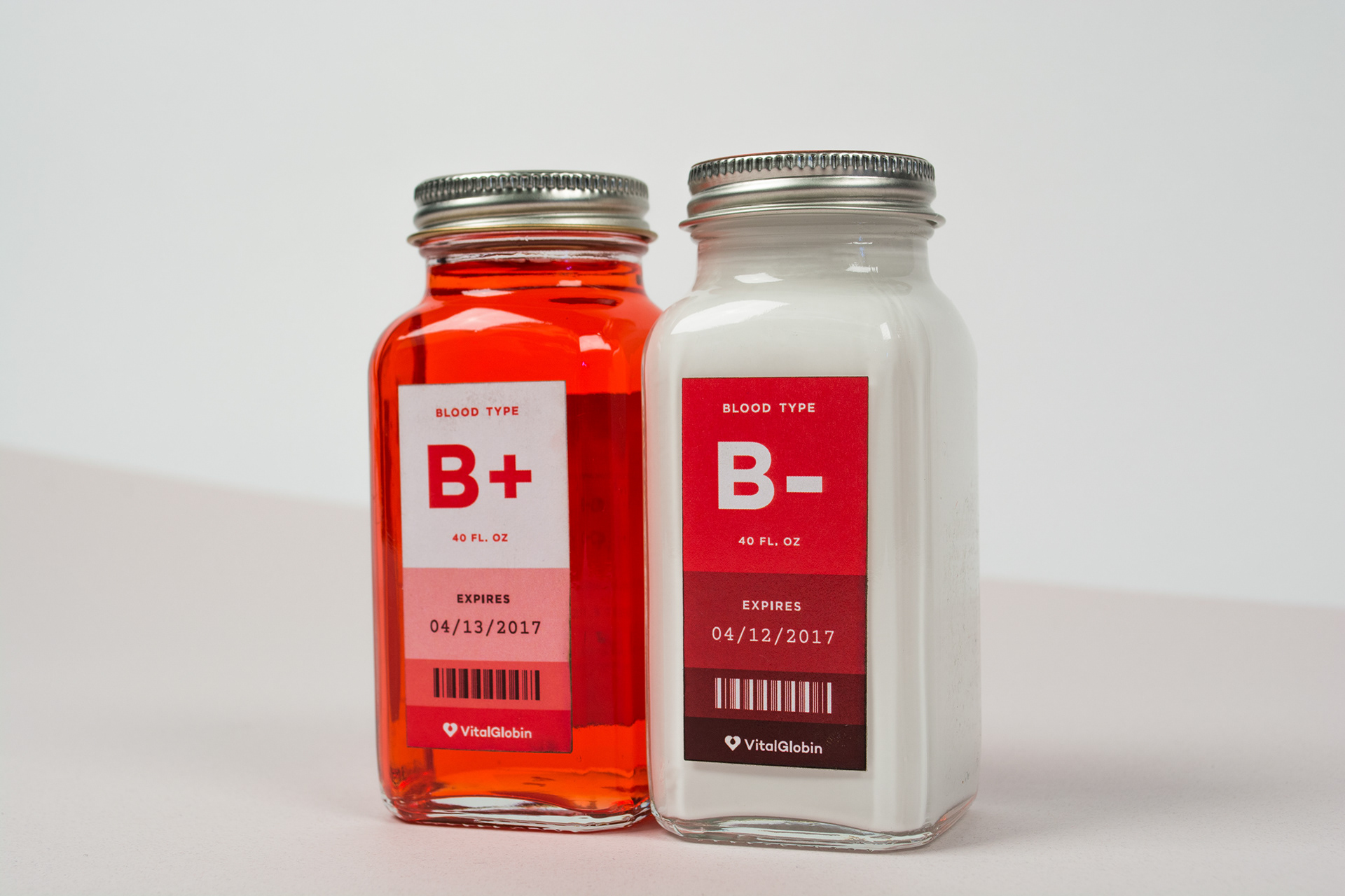
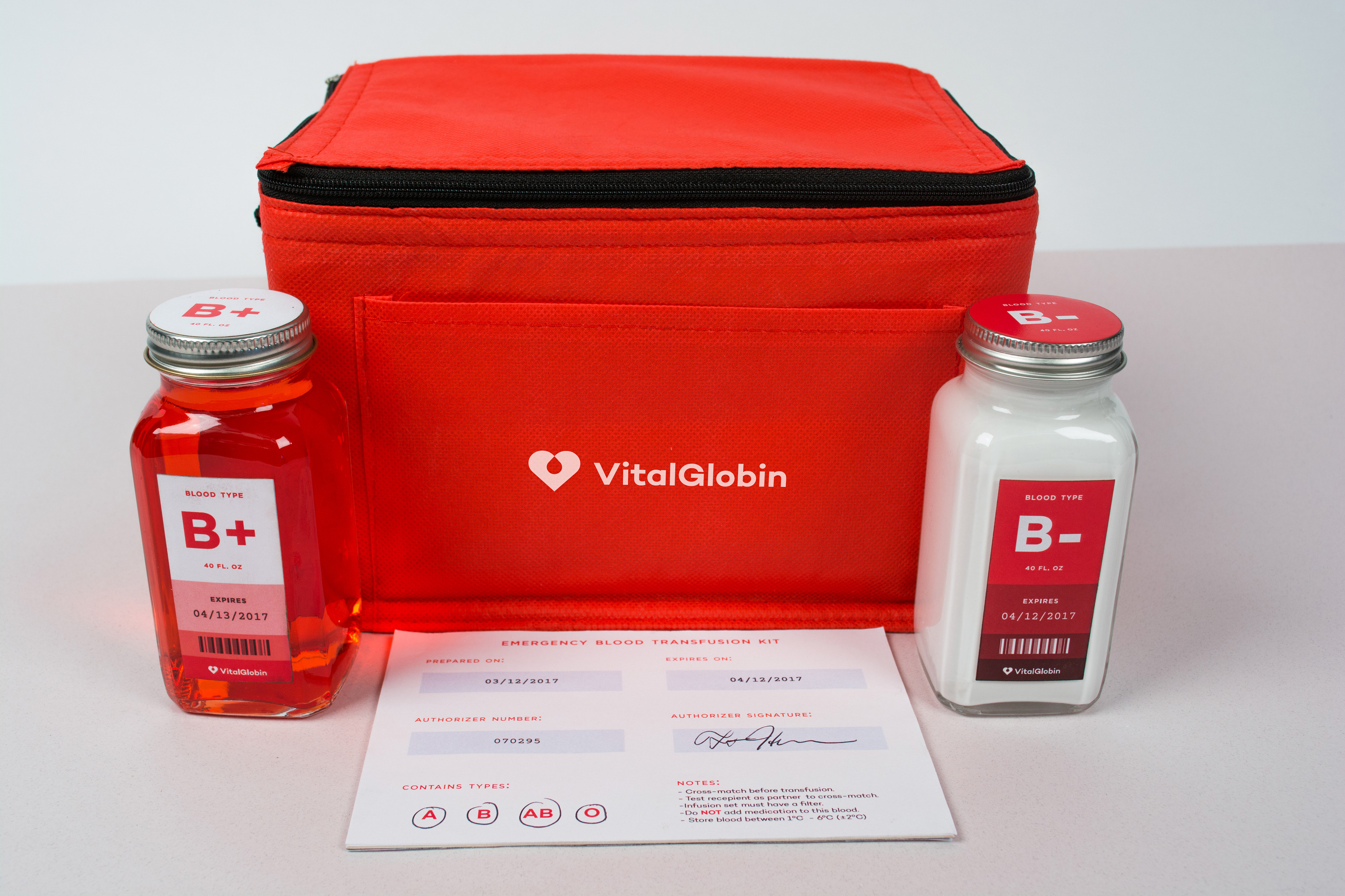
Utilizing a gradient derived from the transfusing and removal of blood, the brand is friendly and approachable due to it's simplistic illustrations, easy-to-read typography and clear directions.
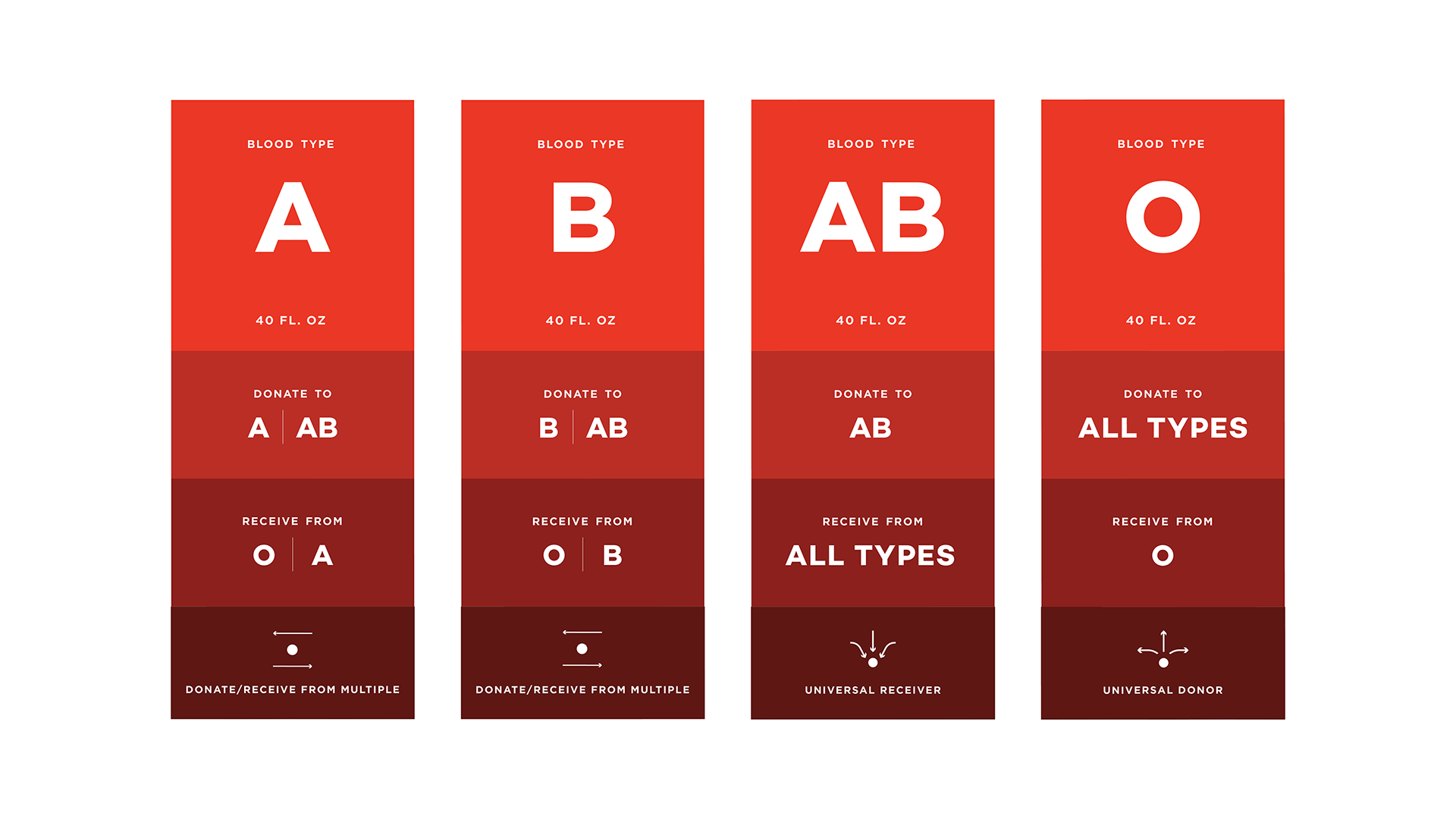
The gradient on the packaging is not only a brand element but is used to create hierarchy for the user. The most important information is always listed at the top in the lightest hue. Moving down, as the hues get darker, the information becomes more and more secondary, finishing off with the branding at the bottom in the darkest hue.
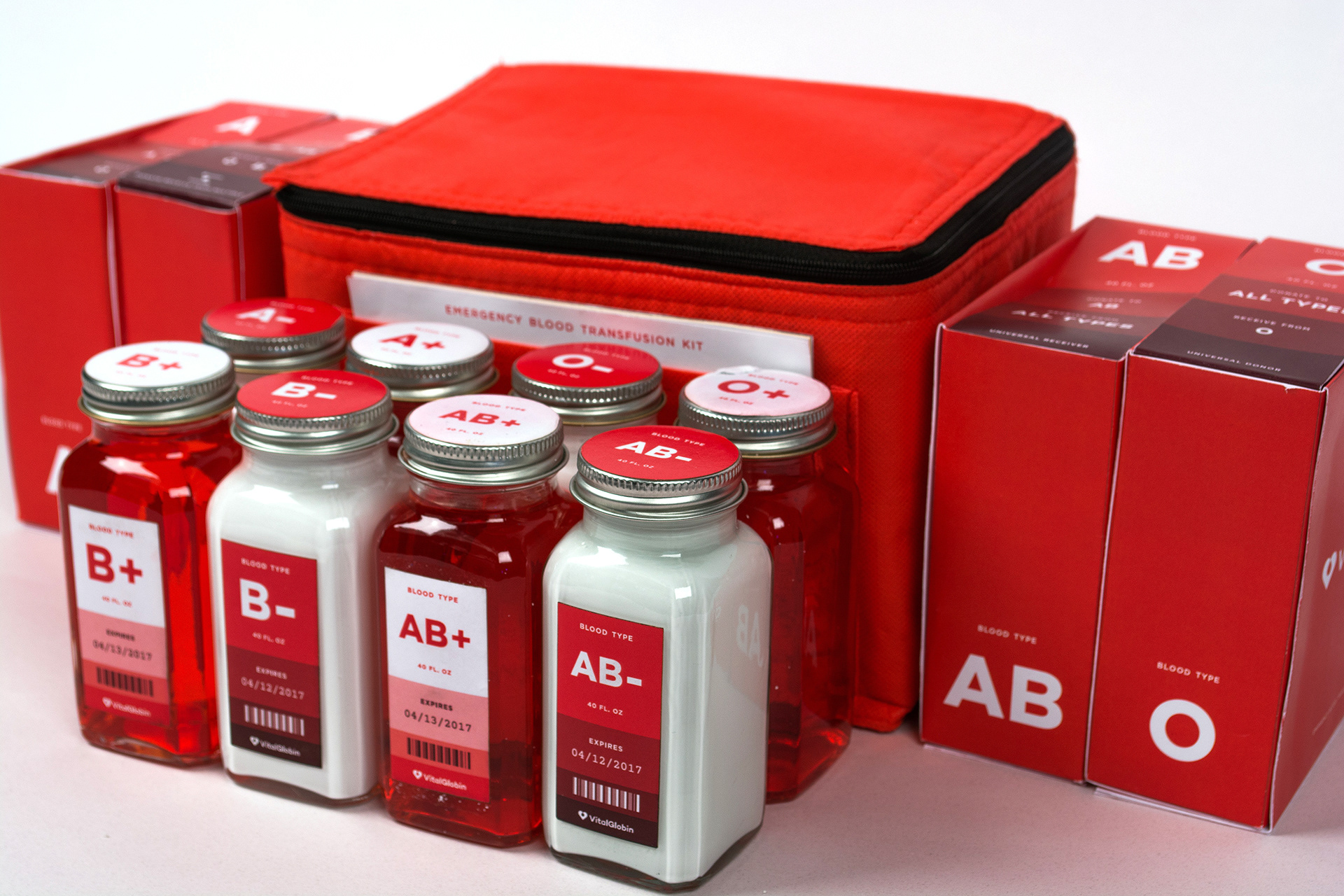
Located conveniently inside the emergency kit, the directions are listed in the form of informative icons. These icons are filled in which are the inverse of the mono-line Blood type icons and so move up on the visual hierarchy. While these directions have been simplified, they still adhere to the AABB's (American Association of Blood Banks's) standards and regulations.
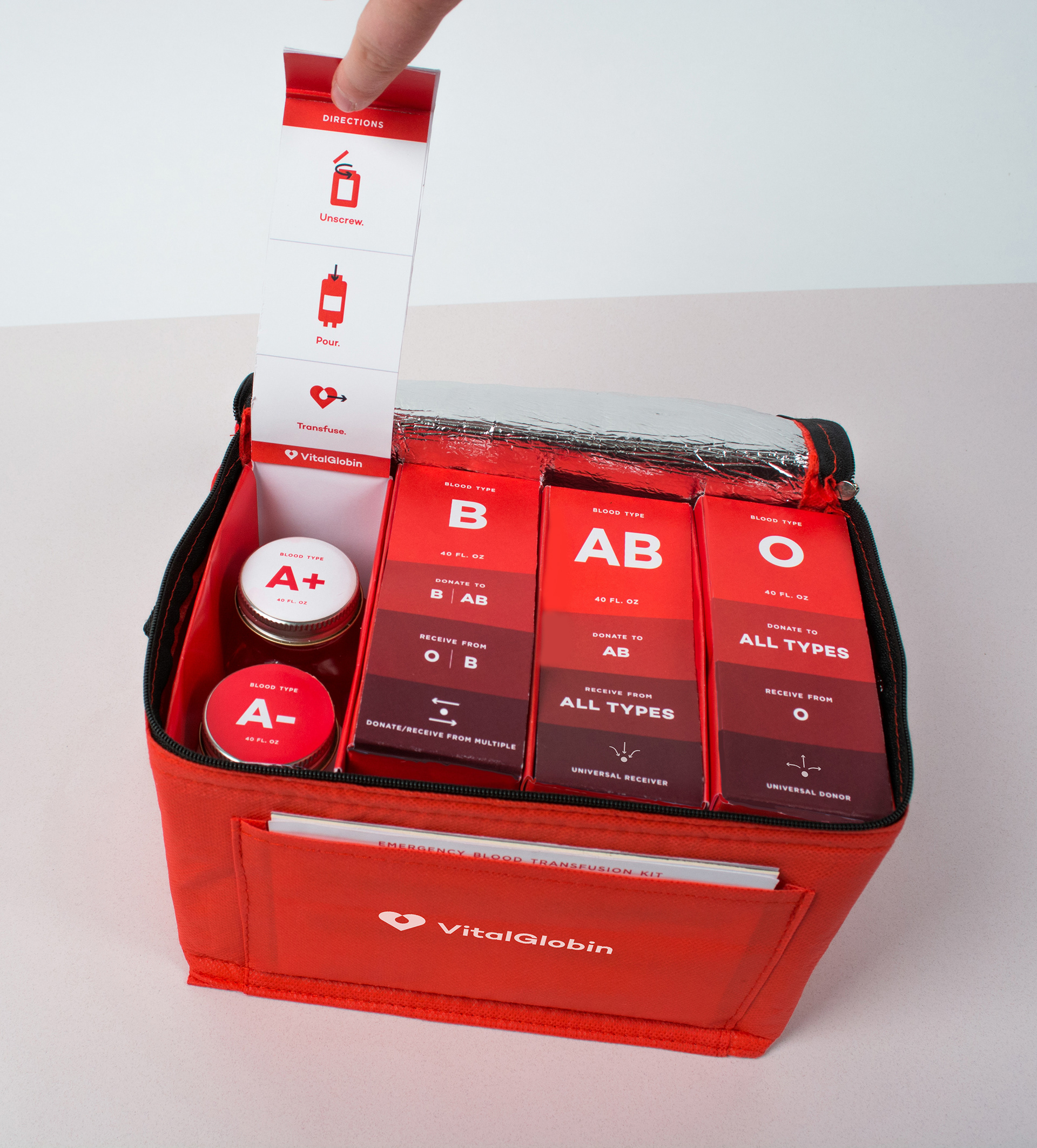

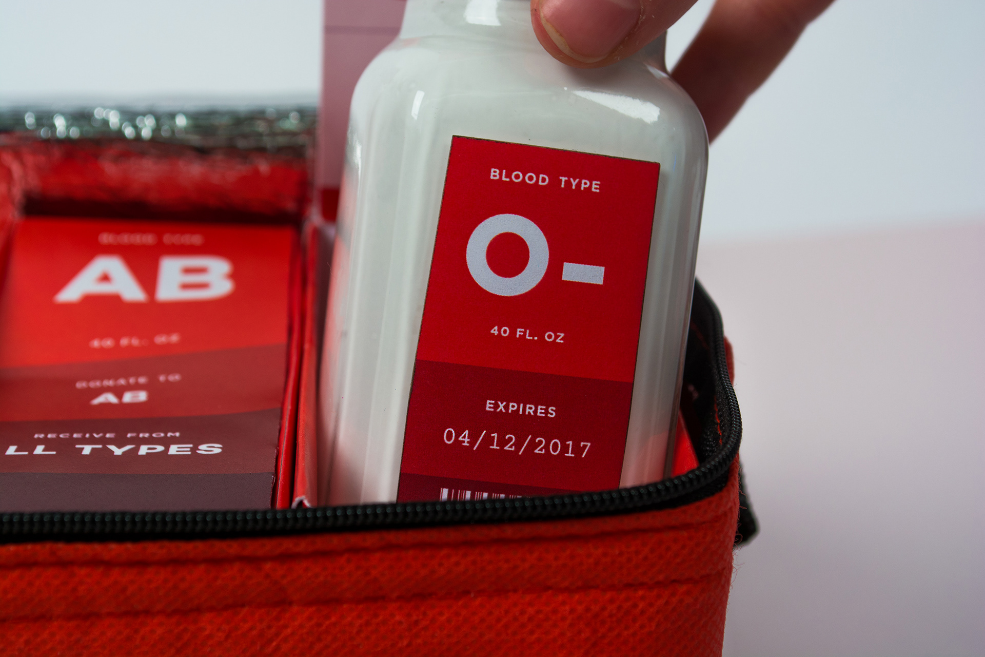
The + and - bottles are not only differentiated by an inverse gradient on their labels but also by the coloring on their respective bottles: Clear for + and White for -. This helps the user quickly identify the bottle through the color and not just the label.

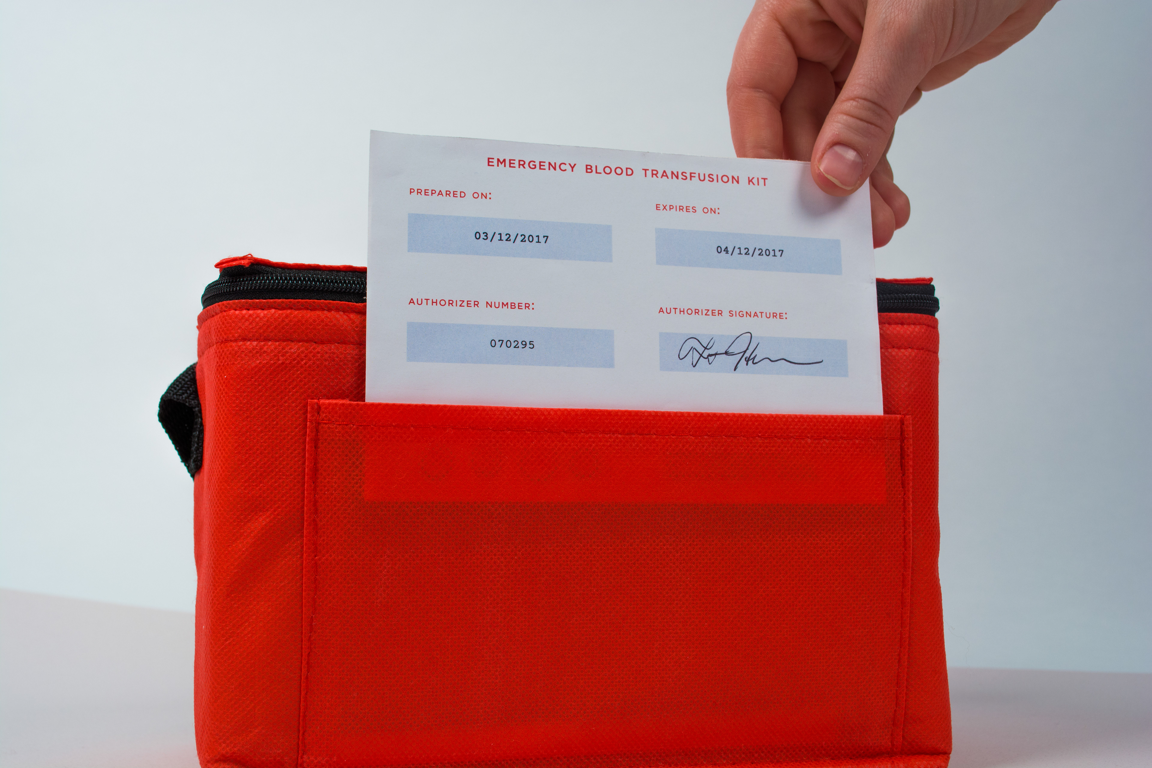
Also inside the emergency kit is the information regarding the medical information that is necessary according to the AABB. Since each kit is made custom, grey boxes have been left in order to have the Authorizer fill in the relevant details and sign.
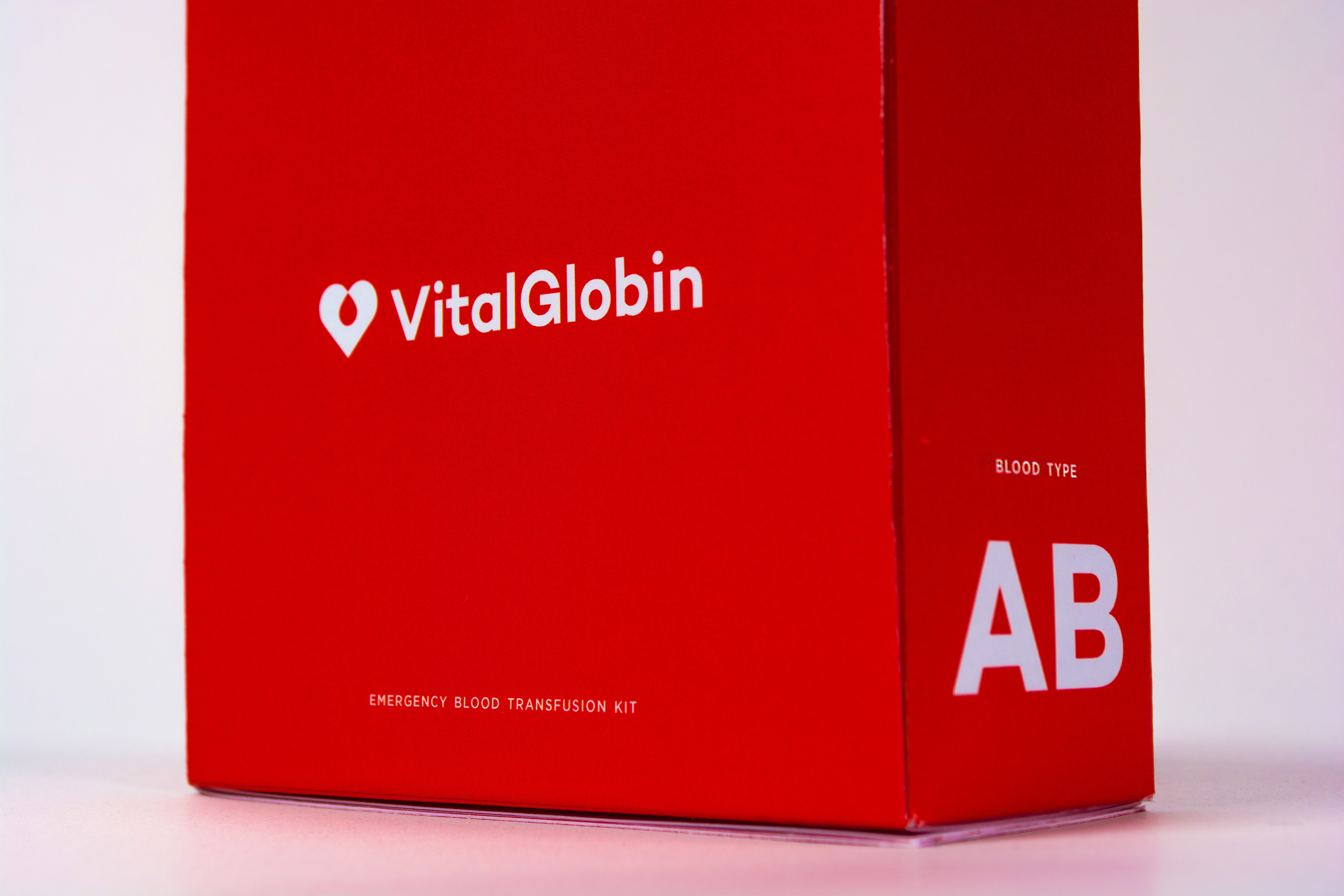
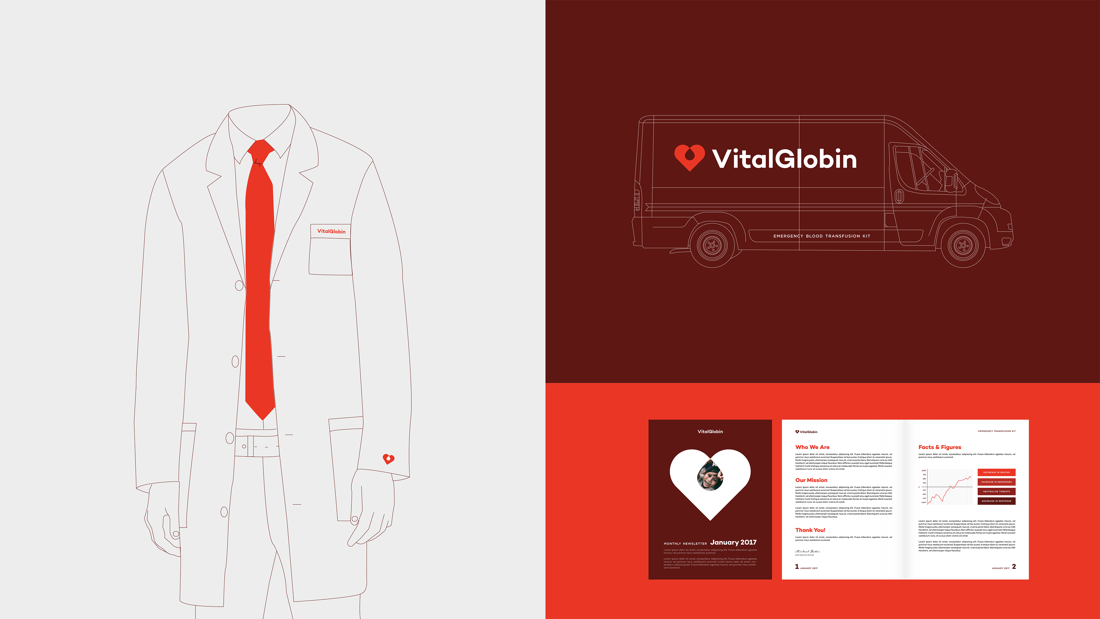
The brand was applied to various collateral, always making sure the brand's attributes and brand idea came through.

Colophon: Surgery Photography from Wikipedia & Google Images